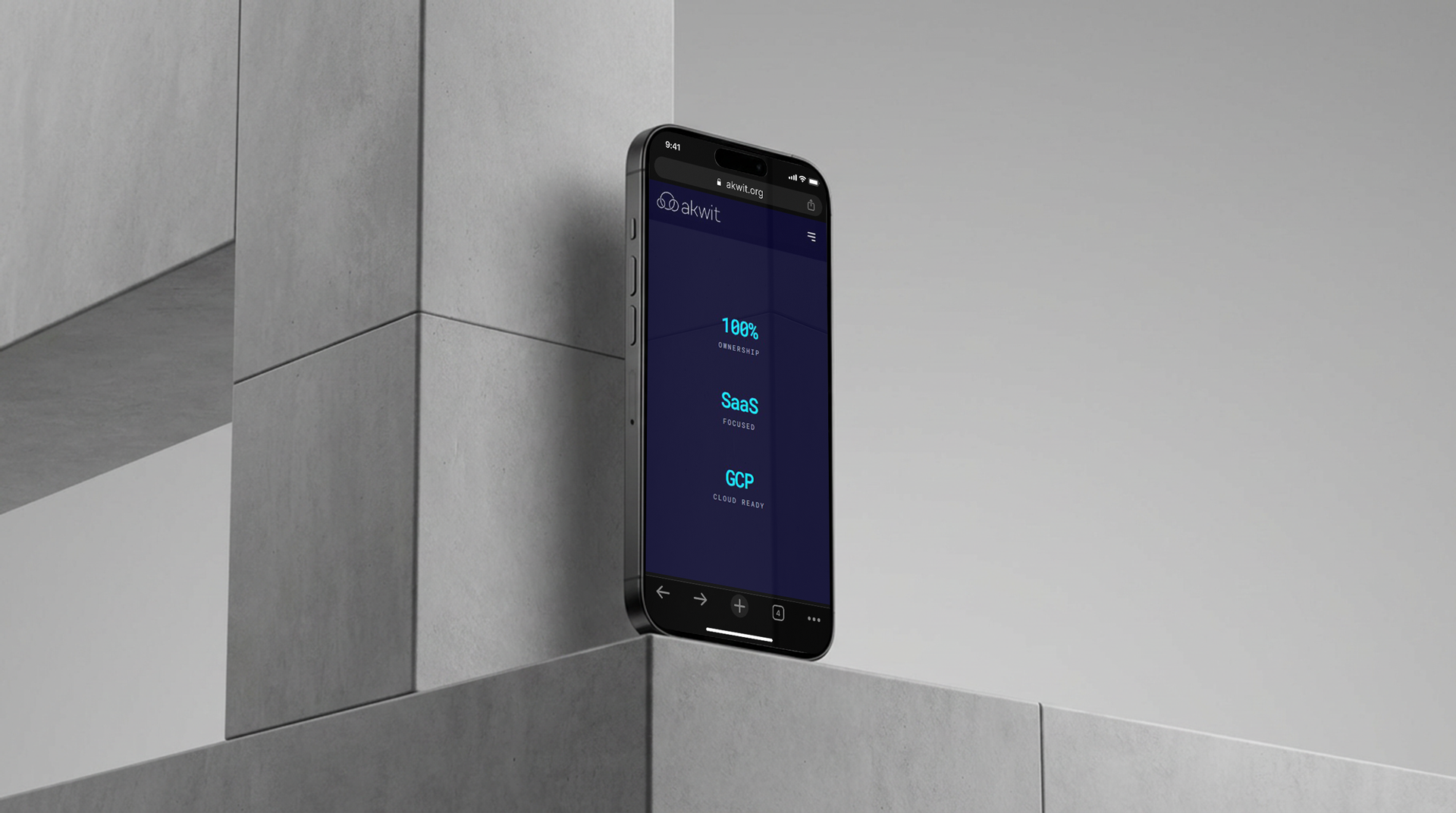
Brand Identity - 2025
Akwit DigitalIdentity
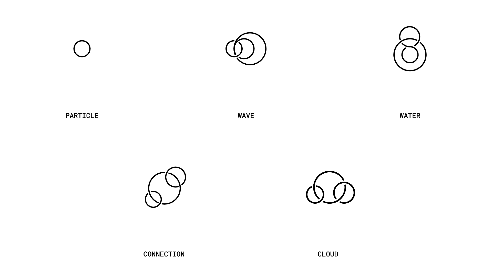
Logo construction: building from a single particle through wave, water, connection, to cloud
The Challenge
Akwit needed to launch a cloud-based IT service into a market where every competitor looks the same: generic shield icons and forgettable tech aesthetics. They had no visual presence and needed to go from zero to credible in a single identity system.
The Solution
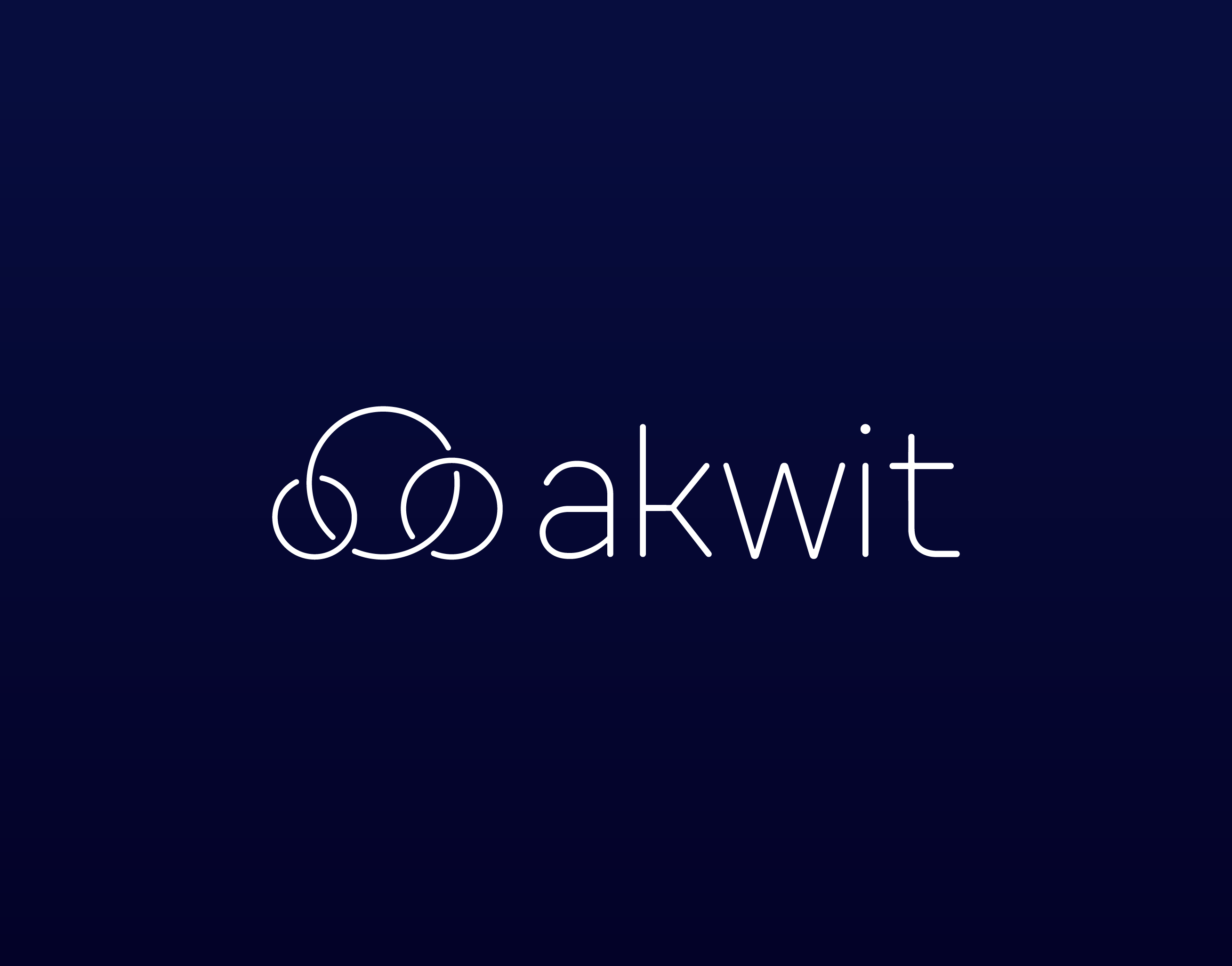
I built the identity around a logo constructed from three interlocking circles, a simple geometric idea that communicates connection, integration, and precision without falling into cliche tech territory. From there, I designed the full system: website, icon set built on the same circular grid as the logo, a typographic hierarchy that works at every scale, and a comprehensive brand guidelines document that lets the team extend the system without me.
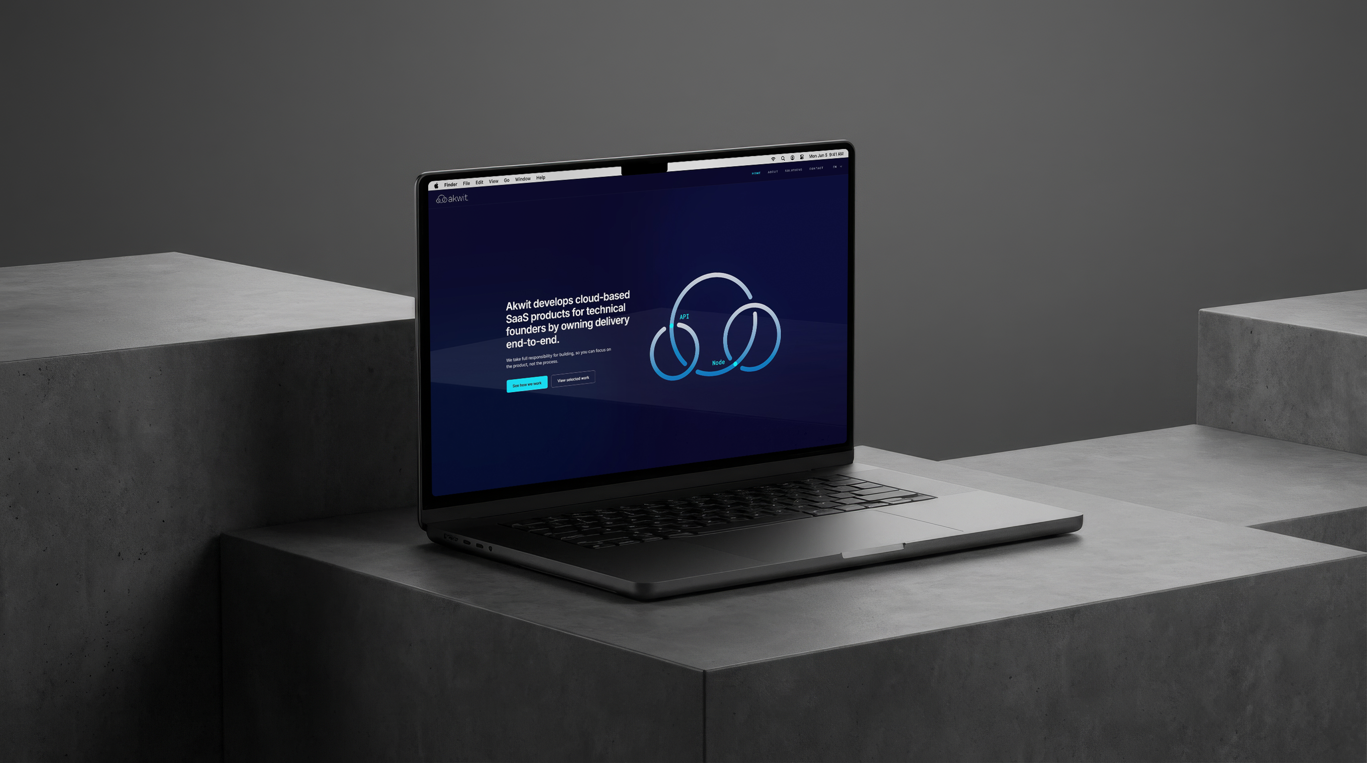
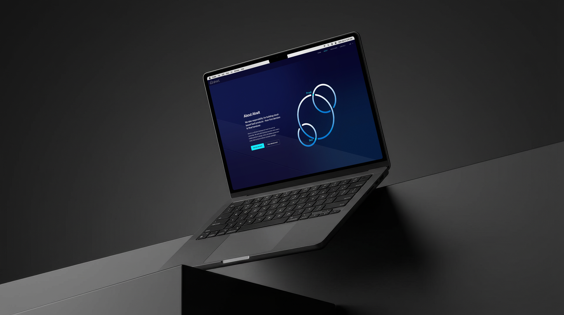
Website design system built on the circular grid
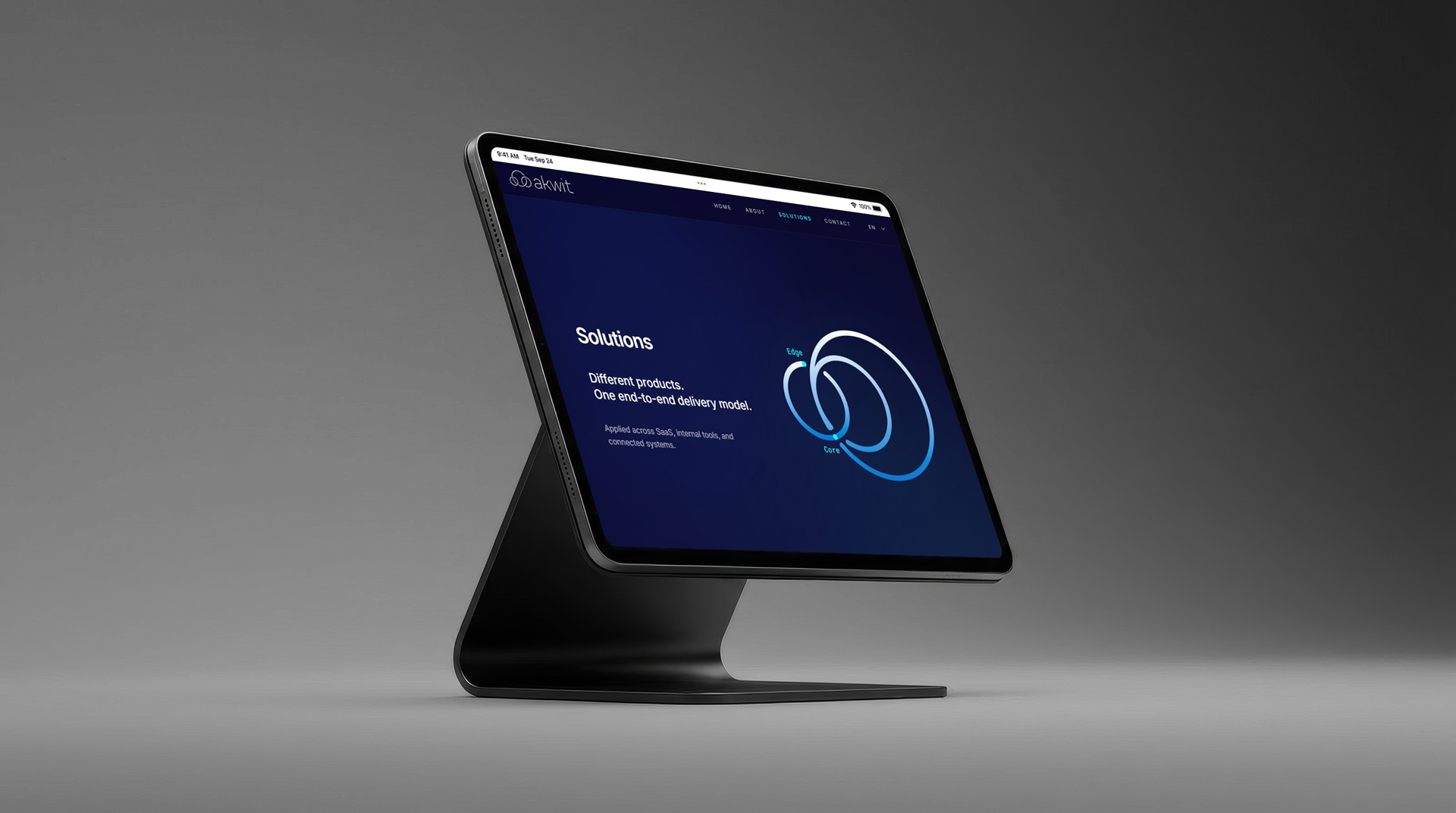
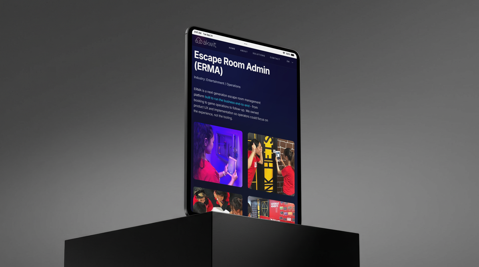
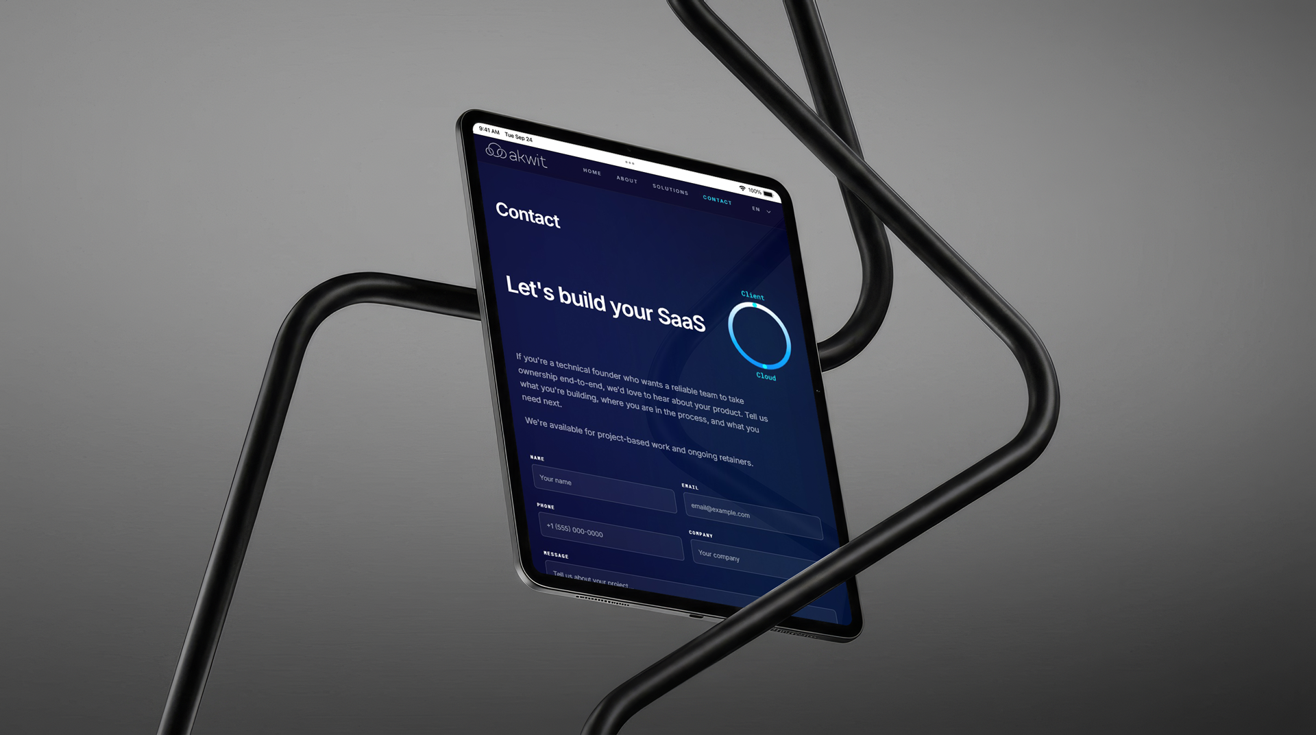
Responsive layouts scaling across devices
The Outcome
Akwit launched with a visual identity that immediately positioned them as a modern, premium IT partner, not another generic tech startup. The system was designed to scale, and it has: the same foundational elements now work across their website, presentations, and client-facing documents.
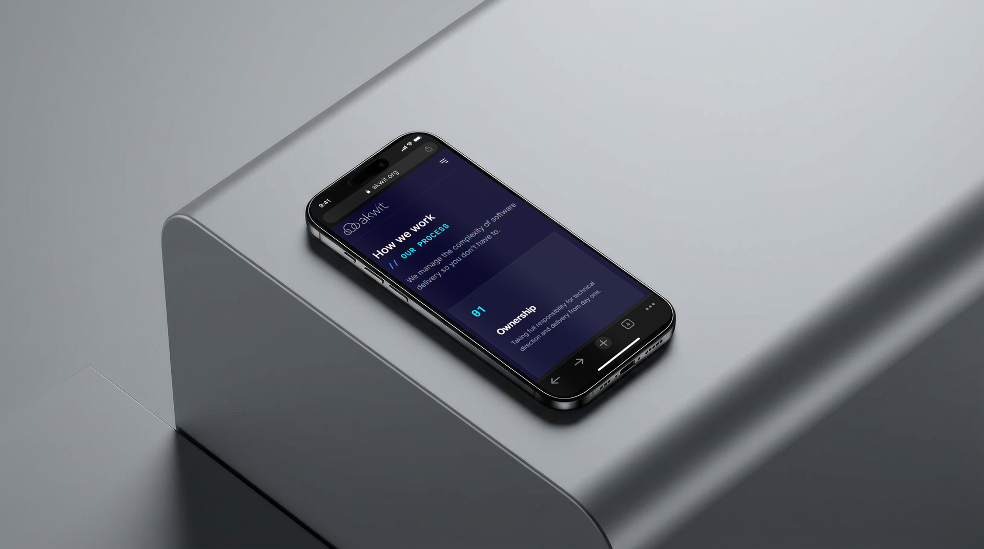
Mobile-first approach ensuring consistency at every touchpoint