Corporate Identity - 2017
Alessandra & LangeCorporate Identity
The Challenge
Alessandra & Lange is a furniture brand entering a market dominated by Scandinavian minimalism and mass-market neutrality. They needed an identity that would stand out on a shelf, in a showroom, and in print, something with enough personality to be memorable but enough system behind it to scale across materials, packaging, and retail environments.
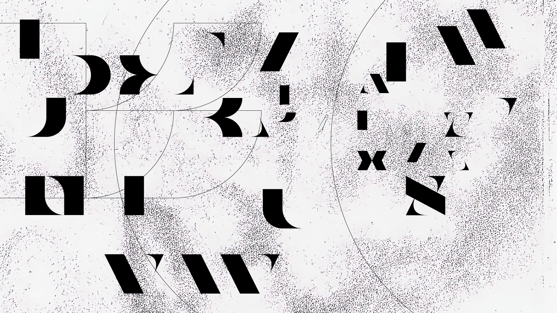
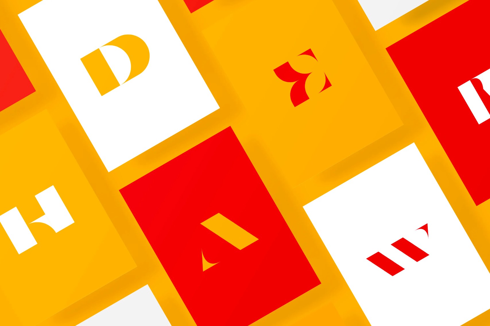
Typographic exploration: deconstructing and reconstructing letterforms to find the brand's visual language
The Solution
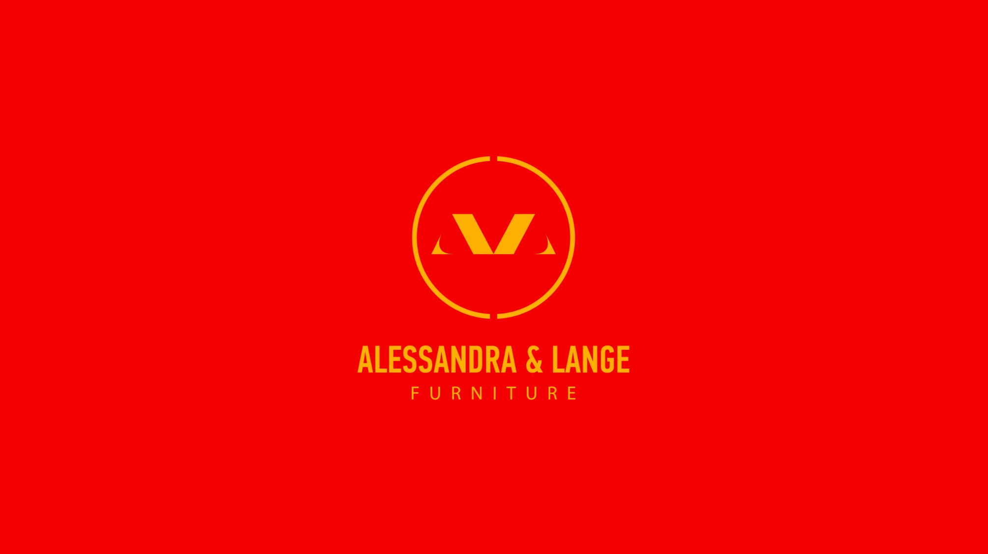
I designed a logo built around a custom monogram that works at every size: from a business card to a storefront. The color system deliberately breaks from furniture-industry convention: bold reds and yellows that create instant recognition instead of blending into the beige-and-white landscape. The typography, stationery, posters, and packaging were all designed as a unified system, with every touchpoint reinforcing the same confident, distinctive personality.

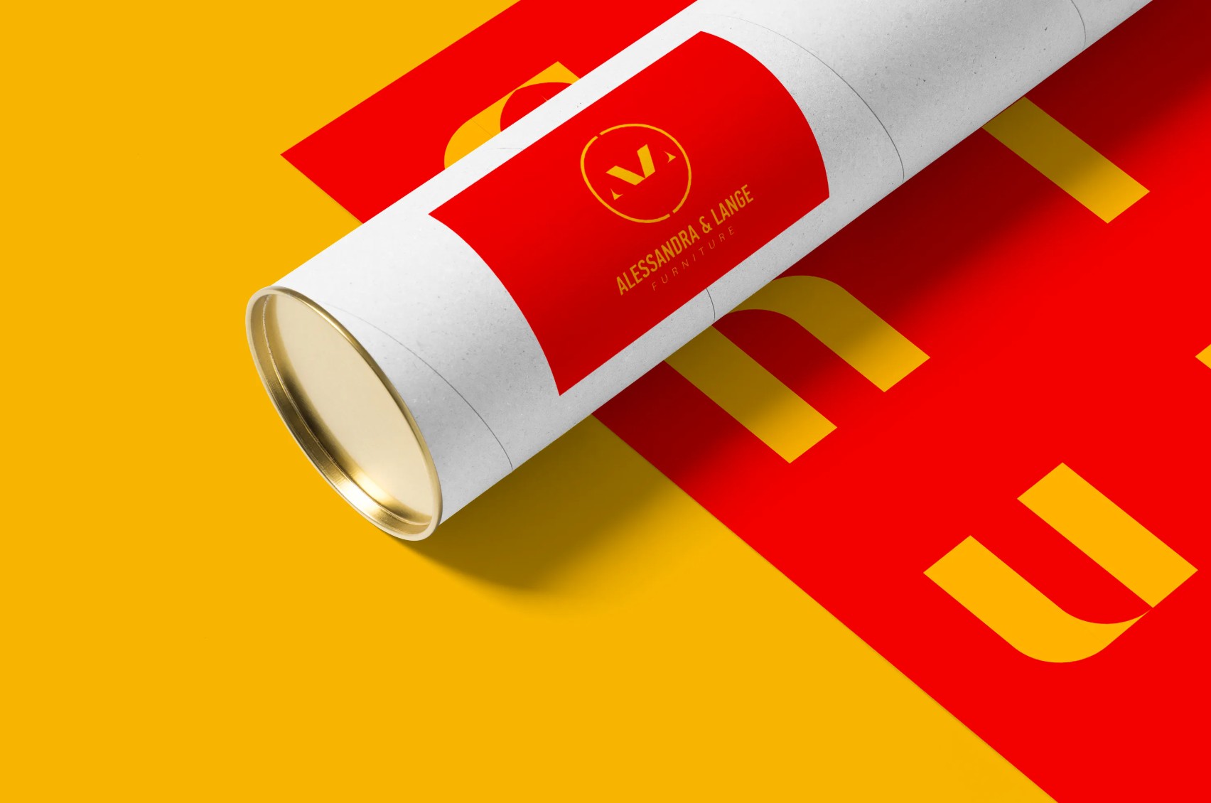
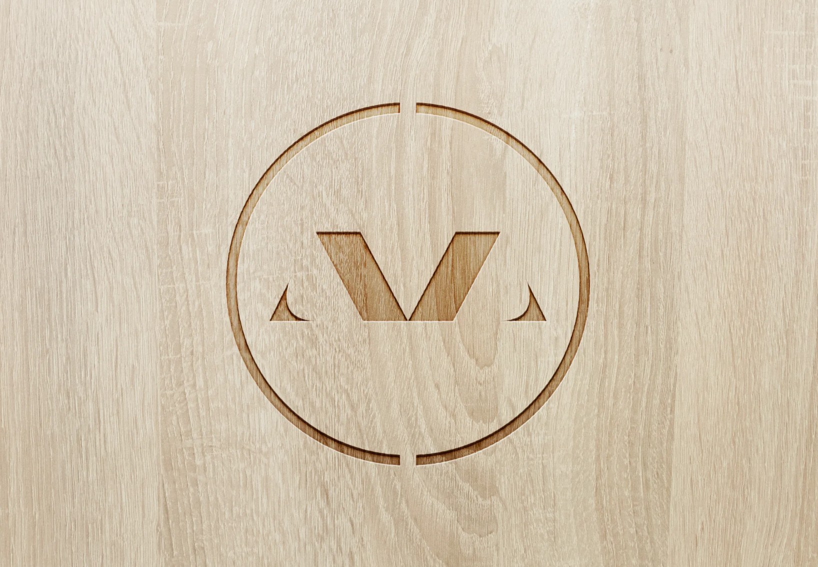
Custom monogram working from business card to storefront
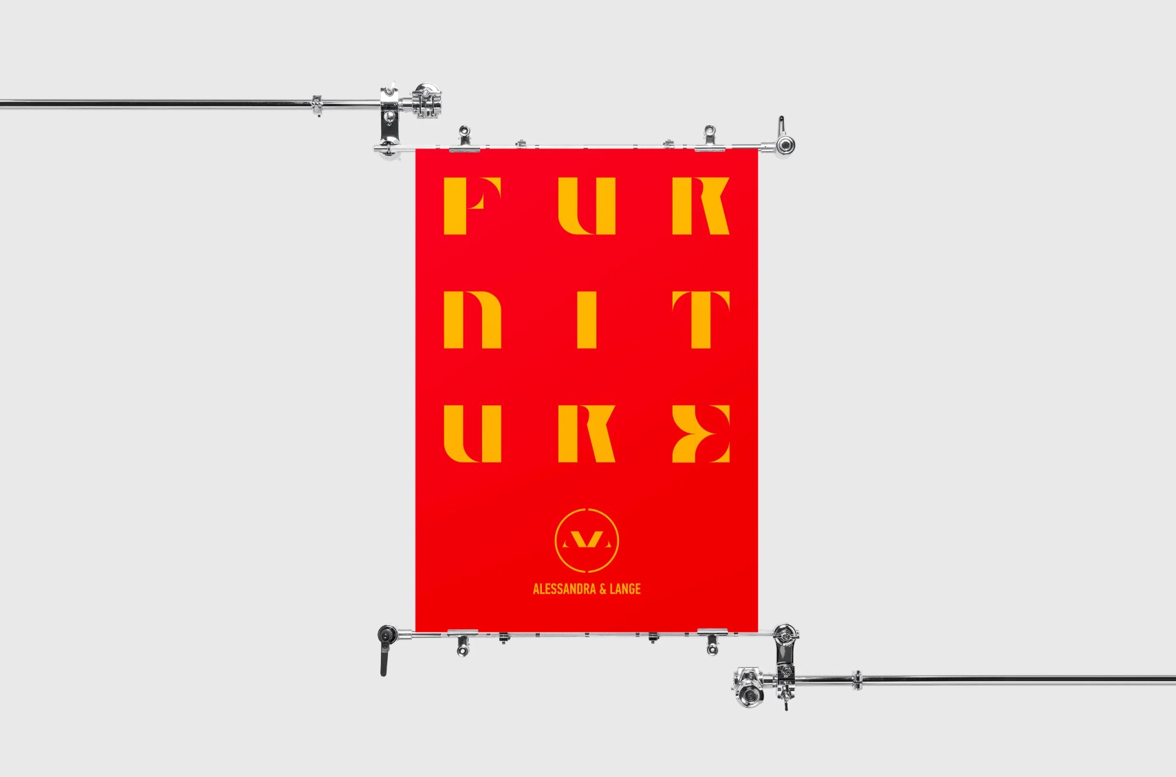
Bold reds and yellows breaking furniture-industry convention

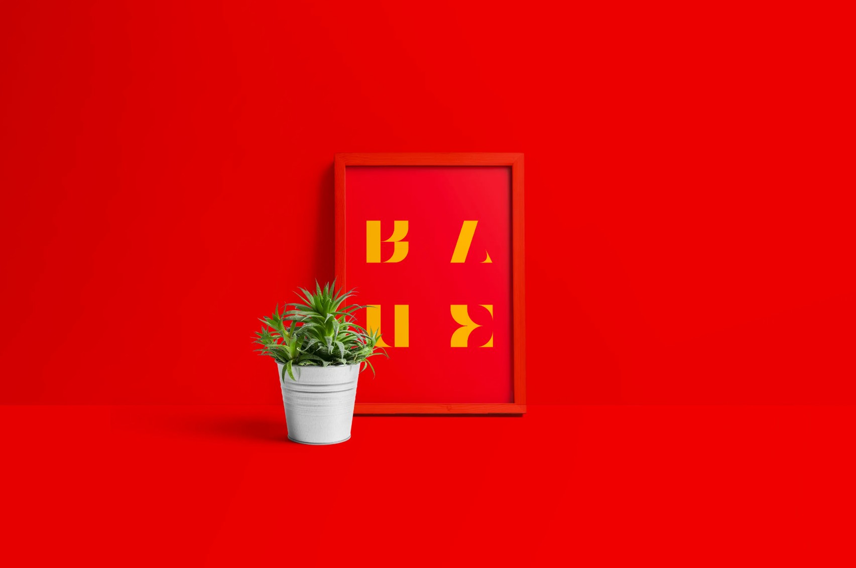
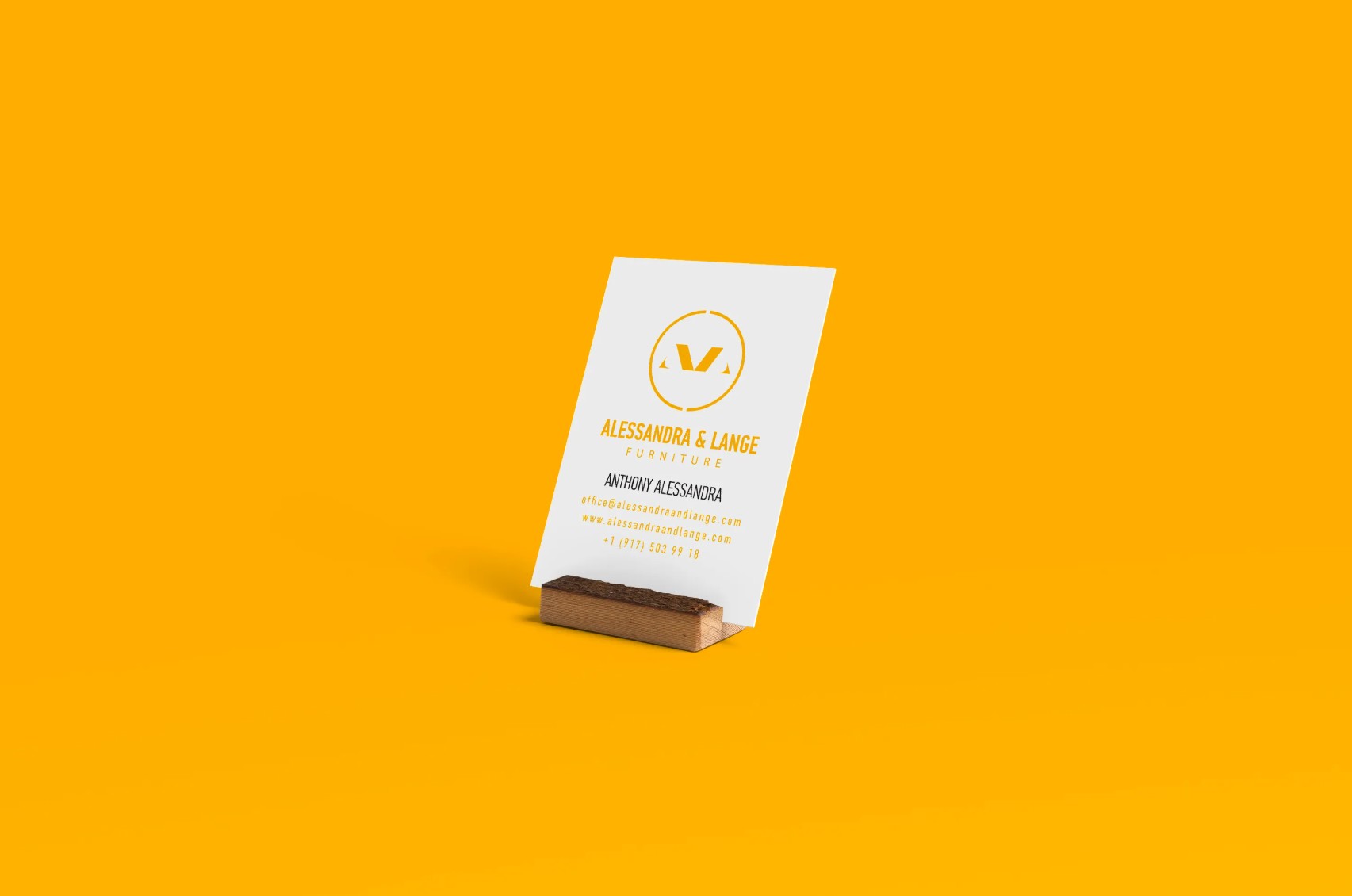
Unified system across print and physical applications
The Outcome
The identity gave Alessandra & Lange a visual presence that stands apart in the furniture market. The system works across print and physical applications: business cards, branded packaging, exhibition posters with a consistency that makes the brand feel established and intentional.